This is the least straightforward set of specifications to post. Why? Because, as we all agree, you can't just slap an interface onto a site. It is an iterative, reflective, developmental sort of task and the efforts below try to keep us all reminded of that! :-) |
In addition to these notes Tom (Smith) has posted some example websites web pages that illustrate some of the problems and issues discussed below. |
What works with children? There is a difference between them being attracted to content and them being drawn to participation. One may be about signposting and metaphor, the other is about seduction and engagement, much more challenging. For this project we need participation.
As a starting point:
It needs to be fun :) and neither banal nor patronising.Children don't like to read instructions on screen. If it not obvious what to do, they won't do it the way you anticipated, or intended.
As a general principle offering different ways to sugnify the same thing allows the user to decide which cues are used and which are redundant. This will vary for different users at different times - just as subtitles on a foreign language film will be more or less useful depending on your grasp of the foreign language, your eyesight, how tired you are, etc. This principle of redundancy underpins all good web design, especially for children; their textual capabilities, and cultures, vary substantially.For example: whenever text is used, reinforcers are needed to identify and categorise it's use. This is particularly important for children that are poor readers: dyslexic, early learners, low esteem readers, etc. In the example below the icons to the left, and the colours, differentiate between "pages" and "discussion". However, the far-too-big icons to the right help to remind us of the tools that created the pages/discussions but by being too big become not just supplemetary information but the primary focus for the eye, confusing the user. Size matters!
here is a page
created 12/3/99
and another page
created 12/3/99
and some chat
created 12/3/99 Children are both conservative and adventurous! The enjoy the familiarity of a constant interface BUT they like the excitement of change. This is not as obtuse as it seems; they like to live in the same bedroom, but redecorate it often - although woe betide the parent that swaps their room, or decorates it, whilst they are away at college. In site design we need to distinguish between the architecture and the decoration perhaps! For example desktop computer navigation relies on folders but users and software authors habitually use other-than-container-images instead confusing architecture with decoration.
This is a folder but confusingly this is used as one by a popular art image CD ROM. In a web page children may have learned the conventions of red text for visited links, or underlining yet for design reasons these are abandoned. Why?
It is worth taking a moment to reject frames (bookmarking doesn't then work properly, printing is confusing, etc), white text on a dark background (printing is confusing), flashing, gratuitous animations, etc. Keep it clean, simple and effective. Users want to use not admire!
Children use a vast variety of browser, computer, OS, screen resolution/colour, speed, bandwidth, in fact they will use anything that can connect them at all. Design needs to reflect this - small screens, limited resolution, many screen ratios, greyscale, colour.... everything.
Remember, children have not lived long yet(!). Images that in your lives have passed from representational to symbolic to iconic may in their lives have merely passed from totally misunderstood to less misunderstood. Think how rarely as adults we use an image to tag a mobile phone number although we often use one for a desk phone number, we haven't had mobiles long enough yet. Similarly few 9 year olds know much about dial phones, dot matrix printers with tractor drive paper or road signs that work for adults although the images might have become tagged in their minds with a concept, the concept may be wrong sometimes:
you think: telephone
they think: telephone too, but for how long?
you think: printer
they think: fax machine or maybe city centre!
you think: no entry
they think: coin-in-the-slot or smoking allowed
Redundancy helps here of course with other cues and clues:
0123 456789
phone
There is also a clear disticintion to be made between Actions and Objects (verbs and nouns) in design terms. It is, of course, always easier to represent a document than the creation / editing of a document.
Some metaphors can be too gender specific and children can be very defensive about territory they perceive as gender specific. For example mechanical metaphors - levers, rivets, plates are typically very boy centric. This does not mean designing for gender, but being gender aware. Remember that we are about seduction and engagement, anything too gender specific is failure for half our users, unless we are bulding gender specific areas. Children carry cultural baggage from very early on.
Not all children function fully on all media channels. Some are visually impaired, some hear poorly, some have English as a second language. This means designing for media redundancy - a button being depressed accompanied by a button-pressing-sound offers two alternate significations. This may seem obvious but with so many reluctant readers additions to text will always be desirable. However, with an imperfect technology we will need to compromise on this, it may be for example (indeed it is,) the case that playing the sound delays the visual feedback too much and thus the short term task may instead be to embed tags in visual objects that can be picked up later and used to trigger aural cues and clues. One thing that must be done right away though is to formalise the use of ALTs with images, when we post them, when children contribute them, we/they should be prompted for a description so that profoundly visually impaireds can use audio their browsers with some hope of success.
Finally, there are no "typical" children. CHOICE NOT AVERAGE is the mantra.
Taking account of all the above is important.TIME
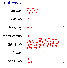
In addition, one of the hardest problems we face is the representation of time in the system. For example in showing the users past activity we might list the places they went in chronological order but it would be better to show it visually, but with the 'redundancy' extra of a count (in this case to the right). The scattergraph information has a time base to it - left is early right is late but this is not overtly labelled by a scale. I the example below most of the chil's activity is early in the day, but Thursday was busy all day:...you could imagine that clickng on the thursday cluster might reveal a similar breakdown by hour for Thursday. Placing "markers" in past activty helps the user to identify their own "trailblazing" as a way of threading through the past.
See also colour and age below
COLOUR
It is probably not practical or desirable to reserve colours for the system (eg red means urgent) because it will limit children's creativity unneccesarily. However a particular combination of colours can be used to signify "the system" - for example in the UK Claret and Blue would denote a particular soccer team - West Ham, in the US gold and red would be the 49ers. Colour is a differentiator, a signifier and a decorator. In the discussion forums for example colour does many things including identifying gender or the two sides of a "debate":
For the motion
Against the motion
I think that there should be a world government and then we would have peace for ever
Simon
I don't trust one politician let alone thousands of them. A world government woud be full of corruption and bad people
Jayne
Selfish governments chasing self interest have done more damage than anything esle in history
Nelly
We don't want peace. History shows that wars are when people make progress wih technology and new ideas.
Dipti and Gupta
I think West Ham are a rubbish football team who couldn't kick their way out of a wet paper bag.
Fred
Aren't you in the wrong debate?
Albert
The formal background, font, font style and plain colours suggests a particular type of behaviour - clearly the same debate can read and evolve differently with other semiotic clues - children like to use these visual clues to signify the different rules of behaviour that might apply in different conferences just as what they write in the school magazine might not be what they write . In these contrasting examples the language would develop in a less formal way in the second space, of course. Users will want to make some appearance choices in setting up discussion areas.
For
Against
I think that there should be a world government and then we would have peace for ever
Simon
I don't trust one politician let alone thousands of them. A world government woud be full of corruption and bad people
Jayne
This is hard. In the Beehive we need to represent the differences between:
all of which need time-centric and people-centric cues and clues. However the tough debate is around "relative to what". A new entry in a daily news service might be something posted in the last hour, a new entry in a family tree might be something added this decade. Similarly an edit for spelling might not 'count' as a revision in a document, but in a dictionary it might count as news! How we handle this is complex. If we offer default settings will they be in absolute or relative terms? For example in a conference due to last for two weeks anything within 5% of two weeks might be "new". If the conference lasted 2 years (a duration is declared for most of our discussion types when they are created) then 5% of two years would qualify as new, and so on. This is a compromise but will work and of course flags the thin client big server advantages of the service too. Some things (a newspaper for example) shouldn't be edited at all but simply get published at an anticipated time, and that's that. Anyway, this areas needs us all to talk through the issues...
Obviously the data we can append to headers and footers, as we have discussed, can help with this: number of visitors to a page, who is here now/most recently; but what else will help? Again symbols, colour, texture all contribute...
This might be a new document and the "new" star
is automatically attached, but for how long? In a news
page in the system "new" might be "today" but in a
different area "new" might be "changed this month". If a
"new" flash is added automaticlly we will need to agree a
default setting for each area. |
This might be a rarely visited document. The same debate about "how long before it gets tagged as 'rarely visited' applies to this as well as to the "new star" (left) and a "new" document. We will need to agree default settings. |
Here is some text that is new and fresh. Here is some text that is new and fresh. Here is some text that is new and fresh. Here is some text that is new and fresh. Here is some text that is new and fresh. Here is some text that is new and fresh. Here is some text that is new and fresh. |
Here is some text that is older and getting older still. Soon it will be too old to view. Its "sell by date" will be need to be set as a default value for each area. Does a texture help? Given that mail in particular cannot be stored for ever (we face finite storage constraints) this is the area where "ageing" text might be most useful. blah blah blah blah blah blah blah blah blah blah |
COMMUNITY AND IDENTITY
There are five core identifiers for individuals:
(1) a visual representation and (2) brief resume, with (3) a summary of activity within the beehive and (4) the communities I belong to and finally (5) some design / colour layout choices. An example might look something like this:
Stephen
writes I live on the coast in Brightlingsea Essex,
currently 50 foot above sea level but with global warming
blah blah blah blah blah . I have three children and am consequently
completely bankrupt and with no socks blah blah blah
blah.
Harold found this out: Stephen
created these things last week
(see
last month
or
last term or
last yearor
everything
):
new task for Brightlingsea Swimming Club freestyle
under 16 team:
lastSaturday
Note the differentiation between
information contributed by the page author and information that
the system has found for you. In this case the user has selected
(from a limied choice on offer) to represent the "system" in the
character of Harold the Dog. The bottom right cell is thus
information that Harold has found, and carries his paw print by
way of reminder.
I work in Ultralab, currently on our space flight project
which is exciting and seems to need more elastic than we
first blah blah blah.
reply to debate on: global
warming:
last Wednesday
reply to brainstorm on: sock design:
last Tuesday
reply to debate on: Vikings and exploration:
last
Monday
reply to debate on: global warming:
last Monday
new task for Maths project graph
team:
last Monday
Using the system leaves various records of a users activity. From flags for read and unread items in the in-tray to posties do authors as well as recipients always see posties when they go to where they were posted? I think so.Key parts of the learning process are both (1) the ability to measure your own progress and (2) to review process. The interface needs to make sense of these functions in the following way:
discussion blueprint | portfolio of behaviours | mail blueprint | project plan timings